
- The front porch trim has all been primed. It looks way better. What you can see of it around the kitchen cabinets, that is. They haven't been moved to the garage yet.
- We have a whole saga about the new doors, which have literally taken over a month to order, escalated us to the Assistant Manager at the blue store, gotten us repeat follow up "I'm so sorry if I pissed you off" calls from the orange store, and have required multiple conversations with the factory about our strangely sized doors. But we have paid for them, and they tell us that they will come. Sometime.
- My cousins Chris and Casey have been super helpful and Casey is going to help us out a bunch this week too, working on demo in the kitchen and mudroom. I think my life will be a lot happier once that kitchen ceiling is down. Dumpster #5 is being ordered tomorrow.
- Almost all of the old plumbing is now gone including the giant cast iron 'stack' - that big hunk of metal running from the top of the roof down under the basement floor, down which everything drains. The stack is coming back in au courant PVC and we are looking forward to being able to flush like champions (albeit with our bucket water delivery system) once again. It's not really picture worthy, and yet, it is excellent.
- We have selected an electrician and had our plans approved by the electric company, so the service and breaker box will be moved and updated soon as well as installing new circuits for the mechanicals. That will be a huge relief and an important first step towards not setting the house on fire.
- As for me, well... I have tried to be helpful. We are in a strange spot where things are advancing in some areas and moving backwards in others. Handling the kid, housesitting, cleaning for showings and jumping through all the hoops before I go back to work has actually kept me pretty occupied. In the meantime, I have been shopping. It sounds like an unimportant, trivial and perhaps even counterproductive job, but the fact remains that someone has to do it and that someone is me. There is a lot of data processing involved, between reading reviews and price comparing and coordinating with other stuff. And I want someone to appreciate my hard work, so here are some things I have recently purchased:
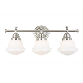
allen + roth vanity light at Lowes.com. In your face, stupidly expensive schoolhouse lights!
This is for the upstairs bathroom.
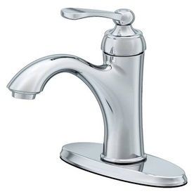
Also at Lowes.com, The Aquasource Norcroft faucet for the pink and black bathroom. Hoping this is a winner because it's about half the price of the Moen Brantford version at the orange store (way, way less than half of what BB&B is selling it for) and the Moen Brantford tub and shower kit comes without the shower head and is mildly affordable and is what I would like to use upstairs.
I know a whole lot more about bathroom fixtures than I want to right now.
The Gaston corner pedestal sink, to display the aforementioned faucet in the pink and black bathroom. Apparently, corner pedestal sinks are stupidly hard to find, I only like this one, and it is only sold at three places that I know of and two of them have them backordered until 9/30/13. Thankfully I got a tracking number on mine tonight (free shipping!) courtesy of Signature Hardware.

And now for some color selection action.
Dining Room Battle of the Turquoise Winner: Valspar 'Sprinkle'

I finally concluded that 1) there was no reason to deny myself the ease of using paint colors I liked by trying to force them to match up to a Benjamin Moore equivalent and 2) there just isn't very much light in the dining room and 3) therefore BM's Jamaican Aqua was too dark and too blue because it just never got enough light. Pantone's Bay was a nice option in the lighter, green direction but ultimately was too green. Someone looking for a lovely vintage green might try it out. Valspar's Sprinkle just glows on the wall, and that is what I was looking for. Keeping my fingers crossed that it will make me as giddy with excitement when it's all over the walls instead of just on my sample poster.
I put sample paint on $0.32 posters from Target. Because otherwise I would have to clean the walls to put the samples up and ain't nobody got time for that.
The living room color was actually pretty easy to find. One sample of Pantone's Ecru and we were good to go. Likewise, Benjamin Moore's Palladian Blue is a winner for the master bedroom, but I had to get it off the porch (and away from the blue carpeting) to see how much I really liked it.
The surprise loser was Benjamin Moore's Yarmouth Blue, which was slated for the other upstairs bedrooms. It was just too dark. The next sample to go up is Valspar's Cincinnatian Hotel Abbey. I have never typed Cincinnatian in my life, and yet there it is. We tried the Icy Blue but it was really light, and CHA is the next color on the paint chip. We'll see. It's a much more aqua shade than I had planned, but the kid really loved Palladian Blue and after I drew the line at having all the bedrooms the same color he was pretty stoked about the 5004-9 card. He was so cute at the store today ordering his sample. The men gave him a blue sucker while they mixed his paint, because why not? That kid gets more swag than anyone I have ever met.
Also, I spend a lot more time re-shelving paint chips than you might believe. I'm actually getting really good at it. That kid loves him some paint chips.
No comments:
Post a Comment